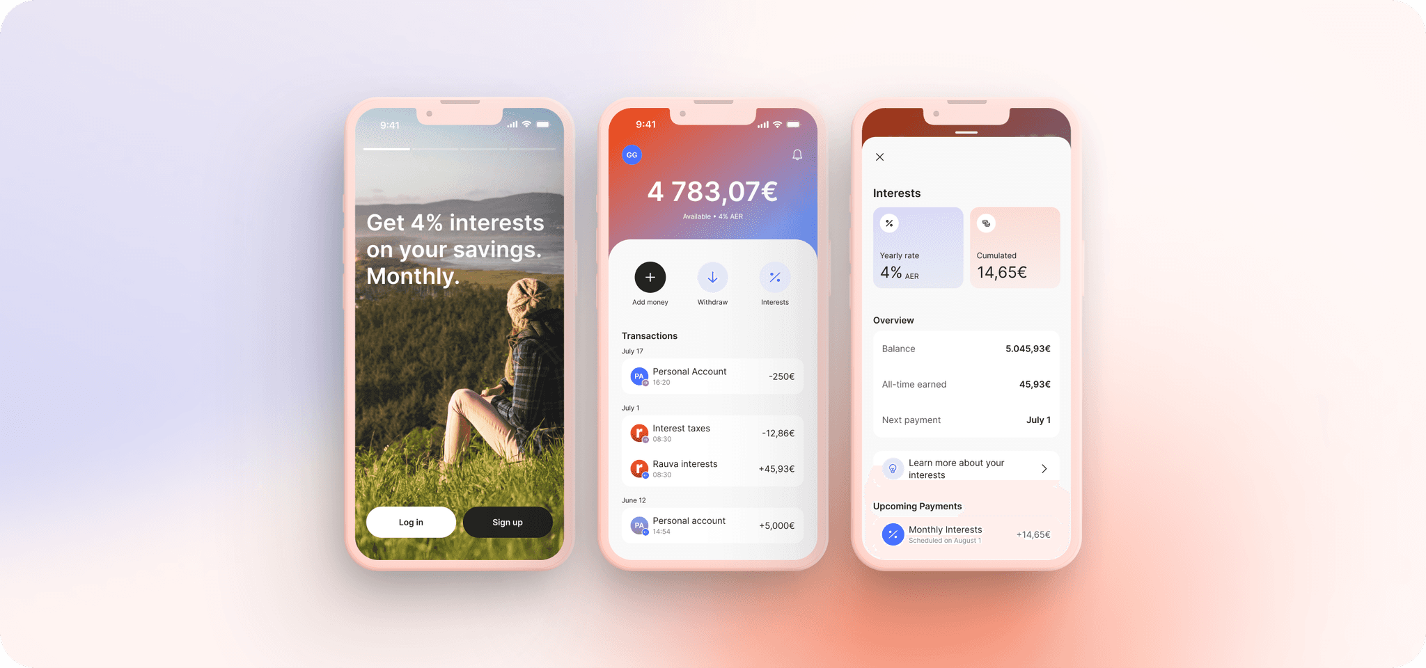
Savings App

Mobile app to make money with your money.

Industry

Fintech B2C

Role

Product Design Lead

Main goals

Discover, design, build and test hypothesis about the app

Rauva's Savings App was created to empower users to earn interest on their savings, both in the short and long term, while actively contributing to their own economic growth.


This innovative approach addresses a gap in Portugal, where such options have not yet been available.

Rauva's Savings App was created to empower users to earn interest on their savings, both in the short and long term, while actively contributing to their own economic growth.


This innovative approach addresses a gap in Portugal, where such options have not yet been available.

Rauva's Savings App was created to empower users to earn interest on their savings, both in the short and long term, while actively contributing to their own economic growth.


This innovative approach addresses a gap in Portugal, where such options have not yet been available.

Challenge

Challenge

Portugal's low interest rates and long-term savings commitments leave consumers with limited options for earning on their savings. Additionally, there is a significant lack of transparency regarding where their money is being invested. For example, users may unknowingly be investing in sectors like oil or tobacco.


Rauva, which is on the verge of securing a banking license from the European Central Bank, aims to improve cash flow, enabling it to support SMBs and strengthen the Portuguese economy by offering better financial services.

Solutions

Solutions

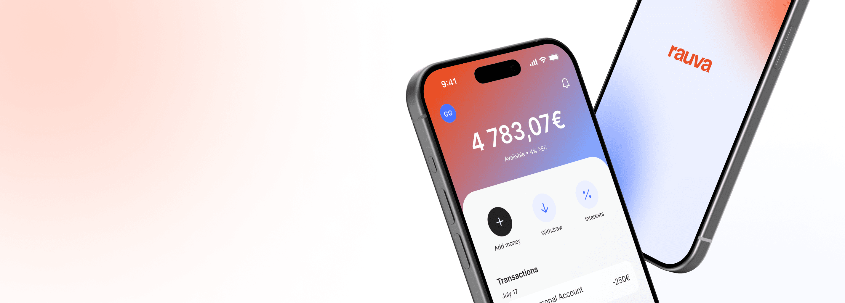
  • Designing an intuitive, user-friendly savings app using Rauva’s existing design system.

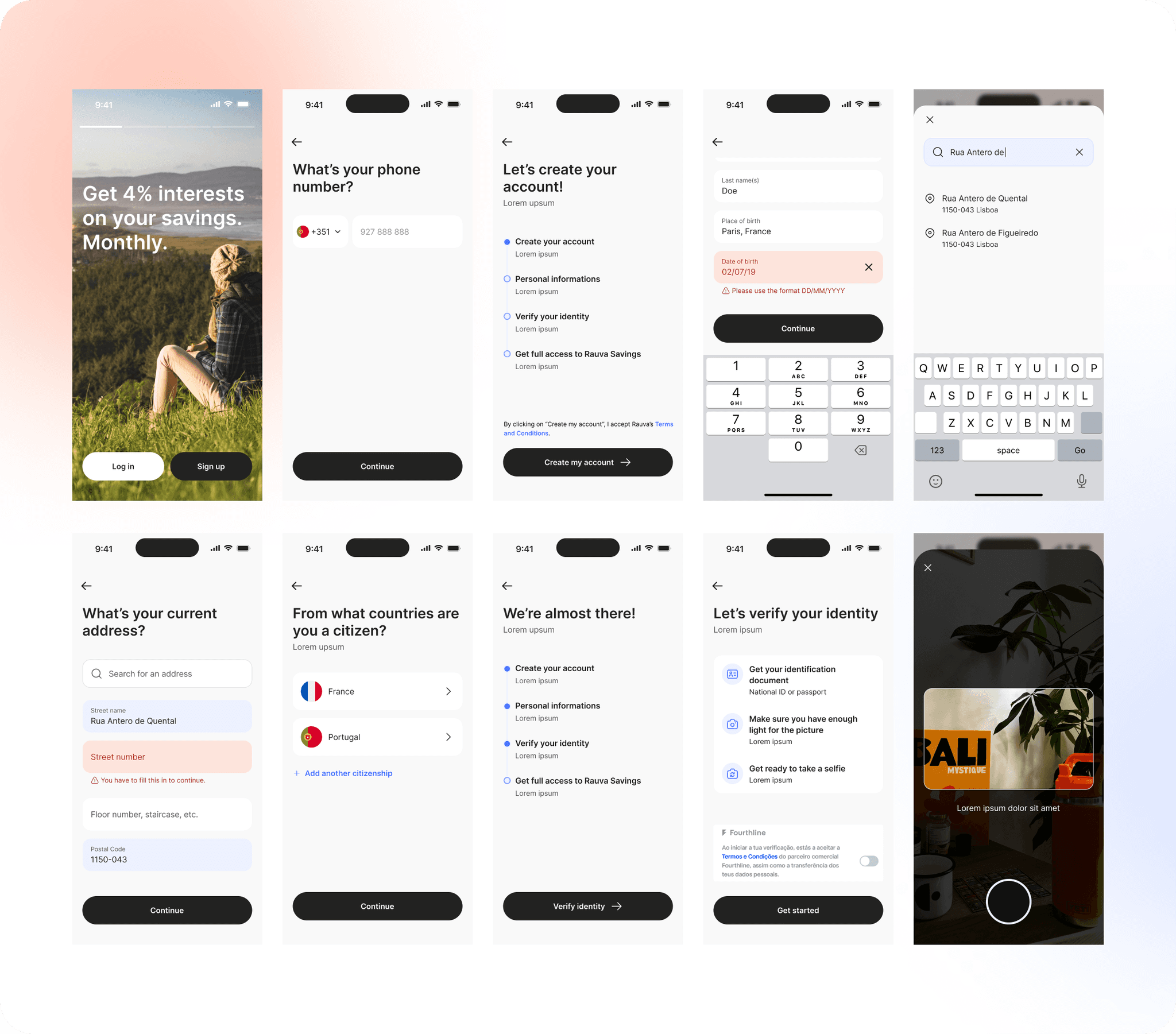
  • Conducting competitor analysis to identify friction points in onboarding and user experience, ensuring that any challenges encountered during testing were addressed.

  • Engaging users early on to validate assumptions and refine the product based on real feedback.

  • Leveraging third-party services like TransactionLink and Fourthline for a faster launch, enabling quick access to critical user data while the backend was being developed.

User interviews

User interviews

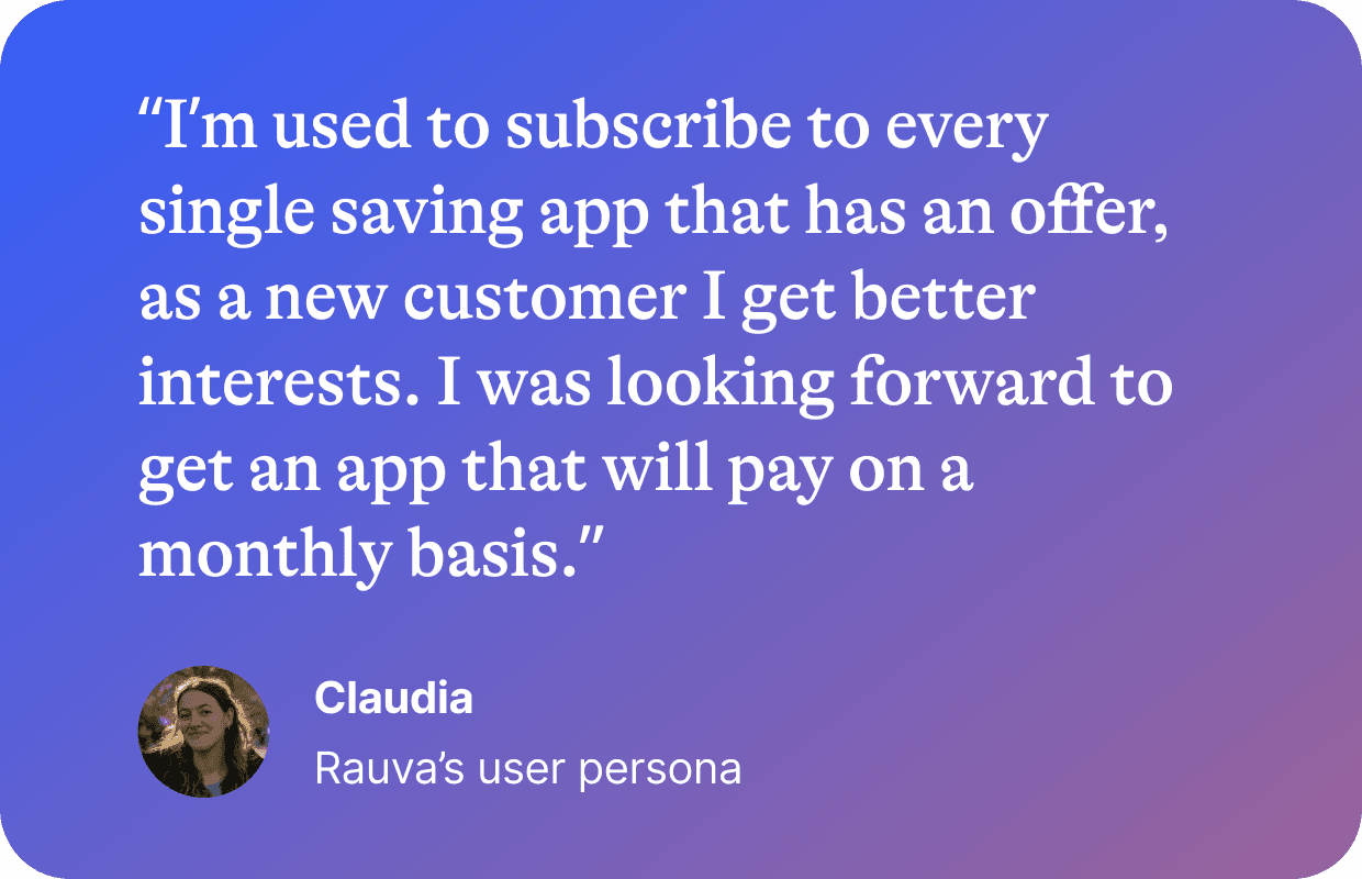
We invited 14 people from the Fintech House, where Rauva is hosted, to understand what they value in a Savings App and what would be missing in the ones they're using


We asked users at what frequency they add money in their savings vault, what do they expect from it and why,


Research insights

  • 50% of the users don't have a savings app

  • 12 people out of 14 are saying that they lack financial "education" to make the best out of their money

  • 6 users were investing in different areas to get interests, whether in crypto currency or ETF's

  • 100% of the users were interesting to be able to invest in the local economy, and were advocating for more transparency

Design sprint & testing

To quickly create a prototype, a team of 2 designers (me included) and a product manager worked for a week to:

  1. Define user needs and analyze competitors.

  2. Design the information architecture and create a prototype using existing UI components.

  3. Conduct usability tests to refine the design.


This allowed us to very quickly move to the next phase: usability tests:

  • The overall feedback was very positive.

  • Sometimes, users didn't understand the copy, as terminology can be a bit complex

  • Users suggested adding payment options like MBway or Apple Pay, which will be incorporated later.

21

usability tests

89%

completion

92%

user engagement

21

21

usability tests

usability tests

89%

89%

completion

completion

92%

92%

user engagement

user engagement

Results

Results

The Rauva Savings App was a success, offering a streamlined, intuitive user experience. The app’s component-based design system allowed for rapid iterations and testing.

  • Task completion rates improved from 35% to 89% over several iterations.

  • The onboarding process, which was optimized based on competitor analysis, was reduced from 15 minutes to just 7 minutes.

  • Users showed a strong preference for educational content, leading to the adoption of more informative screens.


Business Impact
These results directly align with Rauva’s broader business goals: improving user acquisition, increasing engagement, and enabling smoother onboarding to enhance retention. By offering an educational approach and transparency, the app not only addressed immediate user needs but also positioned Rauva as a trustworthy financial partner, crucial for the company's long-term growth as a licensed financial institution.

Design sprint & testing

To quickly create a prototype, a team of 2 designers (me included) and a product manager worked for a week to:

  1. Scope the needs, analyze competition

  2. Define the information architecture and navigation

  3. Create a prototype based on the existing UI components from Design System.


This allowed us to very quickly move to the next phase: usability tests:

  • The overall feedback was very positive.

  • Sometimes, users didn't understand the copy, as terminology can be a bit complex

  • Users suggested to be able to add money thanks to MBway or Apple Pay, which is scoped but for later