Bookkeeping

Improving the overall UX of the bookkeeping journey to increase engagement rate.

Device

Mobile

Role

Product Design Lead

Main goals

Improving the bookkeeping experience based on feedbacks and iterations.

The bookkeeping journey is a vital part of our user's overall experience. To ensure a seamless process, we focused on refining this core aspect.


My colleague and peer Adriana led the research and iteration phases, while I provided oversight and support throughout the project. If you want to know more about her, check her Linkedin here.

Challenge

Challenge

A key challenge for Rauva was ensuring that users on the "Charged" plan, who lack access to an internal accountant, consistently uploaded their receipts on time. Failure to do so could result in fines and delays for both users and accountants, creating significant bottlenecks.


Below, some numbers for Charged users in Q3 2024.

20%

20%

78 users out of 390 with at least one evidence captured

78 users out of 390 with at least one evidence captured

5.5%

5.5%

transactions with an evidence captured within a month

transactions with an evidence captured within a month

5.3%

5.3%

transactions with an evidence captured the same day

transactions with an evidence captured the same day

20%

78 users out of 390 with at least one evidence captured

5.5%

transactions with an evidence captured within a month

5.3%

transactions with an evidence captured the same day

Key Issues Identified

Key Issues Identified

Through feedback and testing, we identified three core areas needing improvement to enhance both user engagement and operational efficiency:


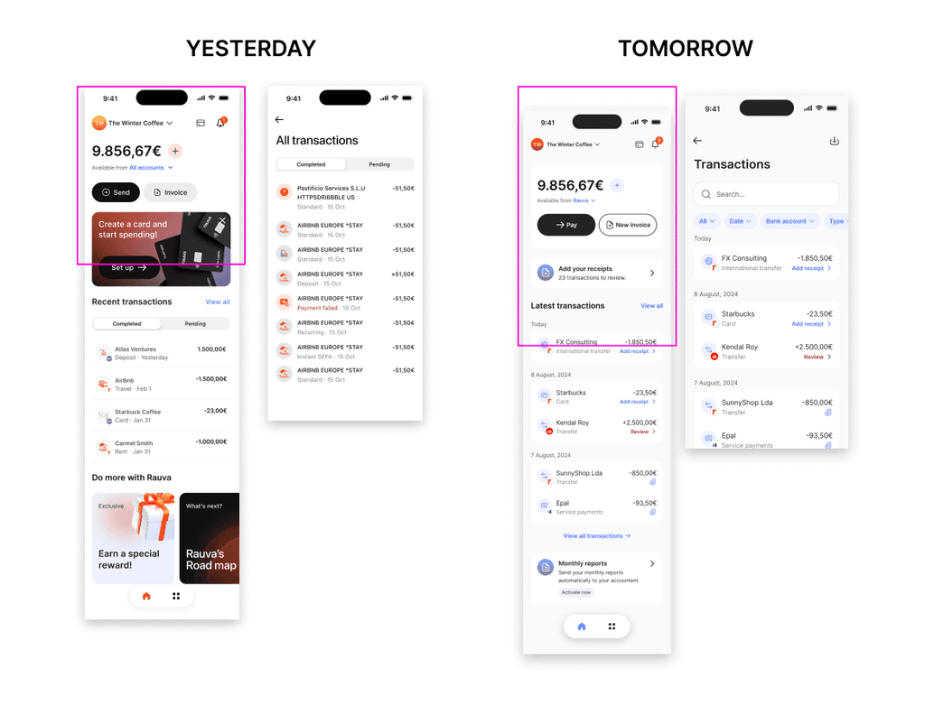
  • Activation: The dashboard lacked clear calls-to-action (CTAs) for bookkeeping, and there was no educational content to inform users of the process's importance, leading to lower adoption.

  • Engagement: Features like the "Missing Evidence" banners were unclear, and the transaction list lacked search functionality, filters, and intuitive navigation, hindering user interaction.

  • Value Proposition: Charged plan users saw little value in uploading documents without an accountant, reducing overall engagement and utilization of the platform.


These issues directly impacted user retention and operational effectiveness, highlighting the need for a more intuitive, engaging experience.

Key insights from the workshops

Key insights from the workshops

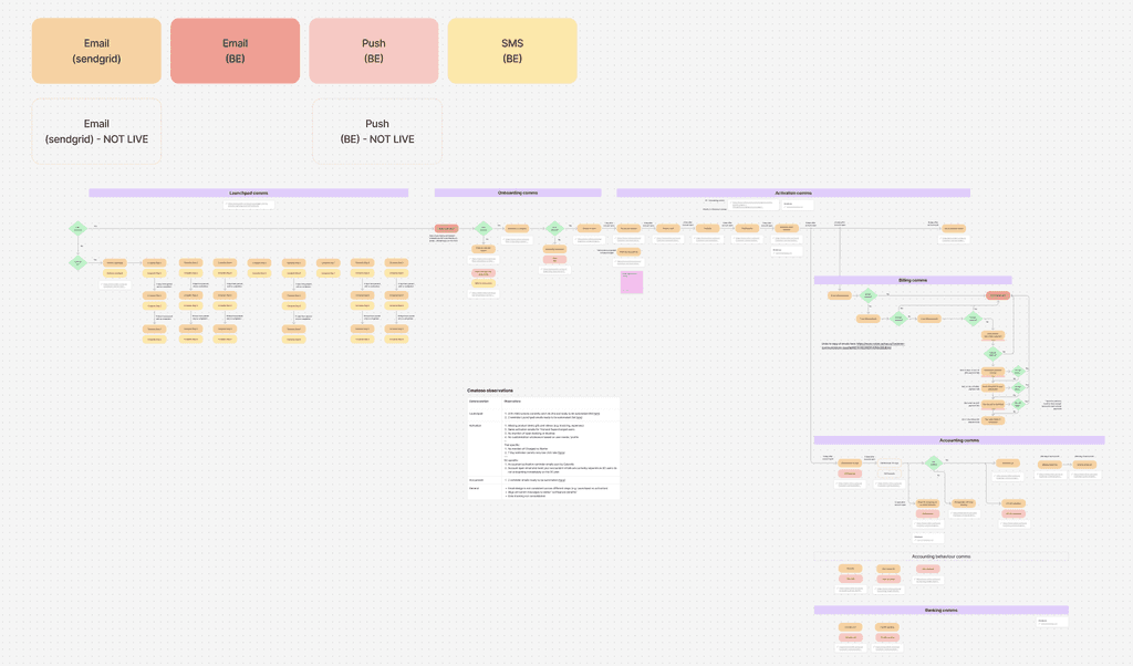
The project manager facilitated workshops to thoroughly understand the bookkeeping process, allowing us to accurately scope and prioritize tasks. Given the project’s complexity, clear scoping was essential to ensure timely execution.


The workshops revealed key communication challenges:

  • Proactive Engagement: The lack of proactive prompts for users to upload receipts led to lower user action and engagement.

  • Ineffective Email Campaigns: Email reminders had a low open rate (1.2%), resulting in missed opportunities to drive user engagement.

  • Interface Complexity: As new features were added, the interface became confusing, reducing user adoption.

  • User Reluctance: The complexity of the Portuguese tax system and insufficient education created barriers to users developing consistent habits, impacting long-term engagement.


These insights helped us identify critical areas for improvement to increase user engagement and streamline workflows, directly contributing to better user retention and process efficiency.

Solutions

  • Transaction List Optimization: Streamlined the transaction list to enable users to quickly find and process transactions, improving efficiency and engagement.

  • Transaction Details: Simplified guidance on necessary user actions, eliminating distractions and ensuring clarity.

  • Category Selection: Simplified categorization and automated key tasks to reduce manual input and improve user experience.

  • Missing Evidence Banner: Made the evidence upload process more intuitive and engaging by decoupling it from categories and introducing a gamified element.

  • Bookkeeping Dashboard: Created an overview of the business with clear, actionable tasks, ensuring users stay on track and complete bookkeeping efficiently.

Design sprint & testing

Leveraging the data and the existing component library, we quickly designed prototypes for rapid testing. This accelerated our transition to usability testing, where we asked users to complete key tasks like uploading receipts and navigating the platform.

  • Positive Feedback: Users successfully completed all assigned tasks, demonstrating the design's effectiveness.

  • User Enthusiasm: The new design was well-received, with users particularly impressed by its aesthetics and usability.

  • Business Impact: Users recognized the value of the streamlined process for keeping their books in order, with many willing to upgrade to the Supercharged plan if pricing were more flexible.

Results

Results

While it's still early to share concrete data, we’ve observed a notable increase in user engagement since implementing the new design.


The improved UI and streamlined UX are driving more users to actively participate in the bookkeeping process, resulting in better task completion rates. These early indicators suggest the redesign is contributing to higher user satisfaction, engagement, and—eventually—greater retention and potential upgrades, which directly support Rauva's long-term growth and customer acquisition goals.

Design sprint & testing

To quickly create a prototype, a team of 2 designers (me included) and a product manager worked for a week to:

  1. Scope the needs, analyze competition

  2. Define the information architecture and navigation

  3. Create a prototype based on the existing UI components from Design System.


This allowed us to very quickly move to the next phase: usability tests:

  • The overall feedback was very positive.

  • Sometimes, users didn't understand the copy, as terminology can be a bit complex

  • Users suggested to be able to add money thanks to MBway or Apple Pay, which is scoped but for later